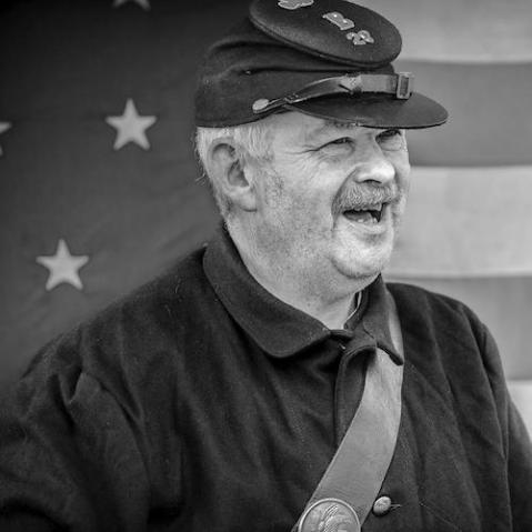
Get the best out of your black and white images with basic optimisation techniques
When you convert an image from colour to black-and-white, it’s important to set some basic parameters that will bring out the best in the photo before you go on to fine-tune it. Whether you use a Raw converter or post-production software, you can use the basic optimisation process outlined here to bring out the three key qualities in a black-and-white image: tonal range, brightness, and contrast.

Tonal range
The first step is to ensure the image contains the complete range of tones from white to black—this is the mainstay of optimisation. How you achieve this will depend on the software you’re working with.
If you’re using Raw-conversion software work through the basic sliders—exposure, highlights, shadows, and recovery for example—before you convert to black-and-white, ensuring that they are all set to their optimum points. Your aim is to fill the entire width of the histogram.
Should you be working on an already processed TIFF using post-production software such as Photoshop or Paint Shop Pro, for example, use the Levels command to set the black (shadow) and white (highlight) points.
Clipping
As well as having a histogram to guide you, most software will feature some form of clipping warning that shows you at what point the black and white tones are clipping, or where they are so dark or so light that they no longer reveal any detail. It’s worth enabling the clipping warning and using it to assist you in adjusting the image until you’re satisfied that the highlights and shadows are accurately set.


When setting the white point it’s important to make the distinction between specular and nonspecular highlights. Examples of specular highlights include the reflection of sunlight off water or the shiny surface of a car. Specular highlights don’t contain any detail and ideally should be clipped, if not the final result may look flat. Nonspecular, or nonreflective, highlights on the other hand, are the brightest parts of the image that retain detail, and should definitely not be clipped or you’ll lose important highlight detail.
Brightness
While tonal range is, to a certain extent, measurable and determined by setting the black and white points, brightness is far more subjective and should be set according to what complements the image and to your taste. Consequently, it’s recommended that you adjust the brightness when you’ve converted the image to its monochromatic state.
Again, how you adjust overall brightness levels depends on your particular software, but a Curves adjustment layer in post-production software offers a good level of control without affecting the black or white points. While for those using a Raw editor, the Brightness slider (or if that is not available, the Exposure slider) is the traditional route, using additional controls if necessary to ensure highlights (or shadows) don’t clip.
Contrast
Finally, assess the image for contrast. Essentially, contrast is the relationship between the brightest and darkest tones; however, it is generally accepted that you exclude the very brightest (specular) and very darkest tones, as taking these into account will usually give an extreme result.

With the sophisticated algorithms found in today’s software, it’s possible to make localised contrast adjustment in which adjustments are made depending on the value of neighbouring pixels (e.g. Lightroom’s Clarity slider). However, don’t be tempted to go over the top with these extra levels of control. If you push these sliders too far, you can find yourself looking at an unrealistic image.
Adjust and re-adjust
While this process is set out as a linear workflow, it’s important to remember that as you make one adjustment, it will have an impact on how the others are perceived. Therefore you might find that after you’ve adjusted the brightness levels you need to return to the tonal range and re-assess it. Likewise, don’t be afraid to tweak tones and brightness when you’ve adjusted the contrast, either.
Michael Freeman’s Photo School: Black and White is where Michael Freeman and Steve Luck show you how to harness the unmistakable power of black-and-white, from timeless, elegant portraits to gritty, graphic street shots. Get motivated by numerous and specific shooting challenges, and be inspired by sample work from fellow photography students, with critical evaluations of the results to improve your understanding of the core concepts.
[one_whole boxed=”true”]
 Michael Freeman’s Photo School: Black and White, by Freeman & Luck
£6.99 Download the PDF now!
This PDF version retains the styling of the original print book.
RRP for print edition: £17.99
[button color=”Accent-Color” size=”small” url=”https://www.ilexinstant.com/product/michael-freemans-photo-school-black-white/” text=”Digital Edition”] [button color=”Accent-Color” size=”small” url=”http://www.amazon.co.uk/dp/1908150971/ref=as_sl_pc_tf_lc?tag=ilexpresscom-21&camp=1406&creative=6394&linkCode=as1&creativeASIN=1908150971&adid=1VMT3E906R3G0XKZS2D8&&ref-refURL=http%3A%2F%2Fwww.ilexinstant.com%2Fproduct%2Fmichael-freemans-photo-school-black-white%2F” text=”Amazon UK (Print)”]
[button color=”Accent-Color” size=”small” url=”http://www.amazon.com/Michael-Freemans-Photo-School-Black/dp/1908150971/ref=as_sl_pc_qf_sp_asin_til?tag=ilexinst-20&linkCode=w00&linkId=&creativeASIN=1908150971″ text=”Amazon USA (Print)”]
[/one_whole]