How to exploit a dominant colour
While it is tempting, and certainly challenging, to search out interesting combinations of colours—to create contrasts or to emphasise a warm or cool colour theme, for instance—not every photograph has to offer a rainbow of colours to be interesting.

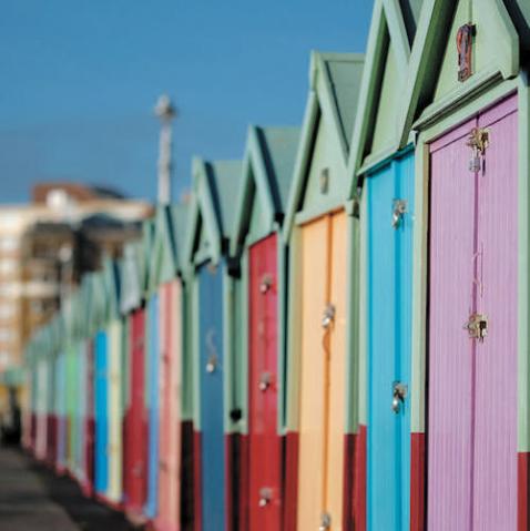
Many appealing compositions, in fact, can be built around a dominant single colour and often a single colour—particularly a bold hue—can have more drama than an image that has a full range of colours. Pictures that boast just a one colour are usually quite eye catching and often they take people by surprise because it’s so rare that individual colours are isolated. Also, single-colour images displayed side-by-side in groups can create a nice web gallery or print collection.
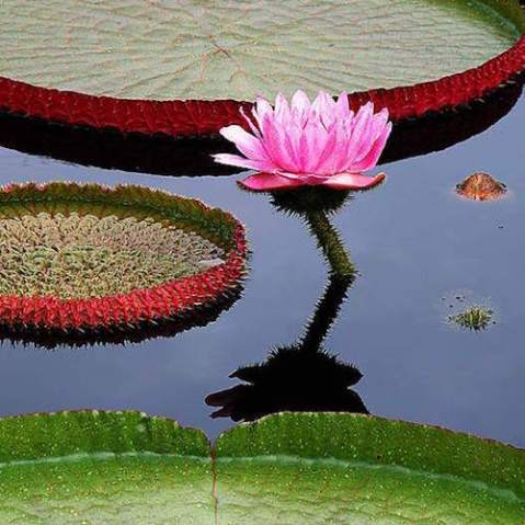
There are a few different ways to approach capturing a single colour. You can use variations of a single colour to create a monochromatic harmony where one colour permeates the entire composition. Used in this way restricting the scene to a single colour has a unifying quality that pulls together the various graphic elements of the composition.

You can also use the power of a single brightly coloured object to startle the viewer by giving it unexpected dominance. Something as simple as a lone pumpkin becomes a bold graphic statement that is more about the colour of the object than the object itself. The human mind also makes immediate and largely subconscious associations with particular colours based on our own experiences or cultural backgrounds. For most of us red means stop, green means go, and yellow means caution—we barely need the words on such signs to complete the thought.

The trick to isolating single colours is to use either lens choice or vantage point, or both, to isolate the subject from its surroundings. Exposure can also play a role too if there is sufficient contrast between the primary subject and its background.
In the case of the pink flamingo, for example, the scene was intentionally underexposed to create a bolder contrast between the brightly coloured bird and the muddy background. Essentially the image becomes one about the flamboyant colour of the bird and its shape rather than a traditional wildlife shot.

In either case, when you underscore a single colour it’s important that the subject has other design qualities that hold the interest—shapes, forms, textures, for instance—in order to hold your viewer’s interest. It’s easy to grab someone’s attention with a shocking colour, but if the photo has no other depth or meaning, it runs the risk of just becoming so much visual bubble gum and has no lasting appeal.
The Photographer’s Master Guide to Color is Jeff Wignall’s thorough course on colour and the role it plays in digital photography, giving you a new understanding of the important role colour plays in the creation of successful photos, and allowing you take outstanding colour photographs with any digital camera.
 The Photographer’s Master Guide to Colour
Jeff Wignall
Buy now!